Wanna know the easiest way to make your bedroom feel like a hug? Bedroom Color. Yep, it’s that simple. What you put on the walls, the bed, even the curtains it all adds up to the vibe. Your color scheme’s like the playlist of your room. Wrong tune? The mood’s off.
There’s no one-size-fits-all answer. What calms me might bore you to tears. But that’s the fun of it finding the palette that makes your shoulders drop the second you step in. Ready? Let’s get into 23 bedroom color combos that feel like a deep exhale.
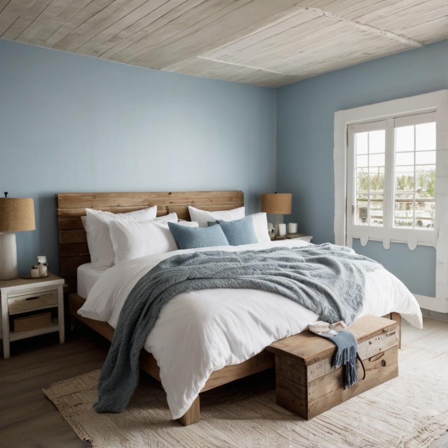
1. Misty Blue & Warm Taupe
Imagine waking up in a cloud. Not the tech kind. A real, quiet one that hugs the hills at sunrise. That’s the vibe misty blue gives your bedroom walls. It’s calm, whispery, like a sigh you didn’t know you were holding in.
But alone, it can feel a bit… chilly. That’s where warm taupe comes in. It balances things out with a grounded, slightly cozy tone that feels like soft socks on hardwood floors. You can paint the walls misty blue and go with taupe curtains or bedlinen. Maybe even a cozy woven rug.

Add textures linen, wool, something with a little rough edge. The mix of cool and warm makes it feel like balance found you. Also, bonus? It works in every season. You won’t get tired of it. Promise.
2. Soft Sage & Cream
Soft sage is that cousin of green who reads poetry and always brings a book to brunch. It’s calm but not boring. You look at it and your heart rate drops just a bit. Cream, on the other hand, is like a warm croissant it goes with everything and makes everything feel better.
Together, they feel like a fresh start. Like someone just opened a window after a deep clean. This combo works especially well if you’ve got a lot of natural light. It doesn’t scream “look at me,” but it also doesn’t fade into the background. Use sage on the walls or even just an accent wall, and let cream take over in the bedding, curtains, and furniture. Add some wooden touches light oak or even whitewashed pine and boom. You’ve got a space that practically exhales for you.
3. Charcoal Gray & Pale Blush
This one’s for the cool kids. Or, at least the ones who secretly wanna be. Charcoal gray is moody in the best way like a rainy afternoon when you don’t have to go anywhere. It wraps around you. But it needs a soft partner, or it can get a bit heavy.
Enter pale blush. Not baby pink. Not bubblegum. Think ballerina shoes left in the sun. Just a hint of color. This pairing is perfect if you like a little drama but still wanna sleep at night. Paint one wall charcoal.
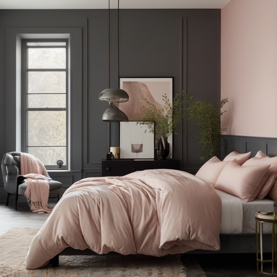
Or go all in with charcoal bedding and blush pillows. Add warm lighting, maybe a brass lamp or a candle that smells like fig. It’s romantic but not overly so. It’s the color scheme equivalent of a velvet couch with a soft throw. Unexpectedly perfect.
4. Sky Blue & Crisp White
You can’t go wrong with this one. Sky blue is fresh air in a can. It’s light, breezy, and just makes a room feel bigger. Especially if your bedroom’s tiny and you’re kinda over the “cozy cave” look. Pair it with crisp white like, hospital-clean but make it fashion.
The blue calms you down, the white keeps things sharp. It’s very “vacation rental in the Greek islands” energy. Think white linen sheets, a fluffy duvet, maybe even some driftwood décor if that’s your thing. It’s the color combo for people who need their space to breathe.
Not ideal if you’re into dark cozy corners. But if you like waking up feeling like you slept under the open sky? This is your match.
5. Terracotta & Off-White
Earthy. That’s the word that always comes up with terracotta. But it’s not just “mud red” like people think. True terracotta has this almost baked quality, like clay pots that sat in the sun for too long. It’s warm, grounded, and gives a room a deep sense of comfort.
But it can get heavy if it’s everywhere. That’s why off-white is the perfect partner. Not bright white off-white, with a creamy undertone that softens the whole thing. Terracotta on one wall, off-white on the rest.

Add woven textures, maybe some dried flowers, a chunky blanket that makes you want to cancel plans. It’s rustic, yes, but not in a farm-chic way. More like, desert Airbnb with great lighting and homemade chai. You’ll feel hugged by your own room.
6. Dusty Rose & Light Gray
Dusty rose isn’t your grandma’s pink. It’s grown-up, a little nostalgic, and weirdly comforting. It makes the room feel warm without being too sweet. Like rose petals left in a book.
Light gray is the calm partner it needs. It neutralizes the pink without draining its charm. The pairing is subtle, but when it’s done right, it’s wow. Use dusty rose in the details pillows, throws, maybe even curtains. Let gray be the base.
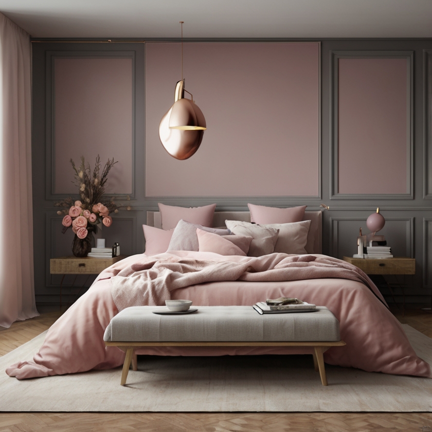
Together, they make a space feel like a journal entry. Soft. Personal. And quietly beautiful. It’s a good option if you want warmth without going full “romantic drama.”
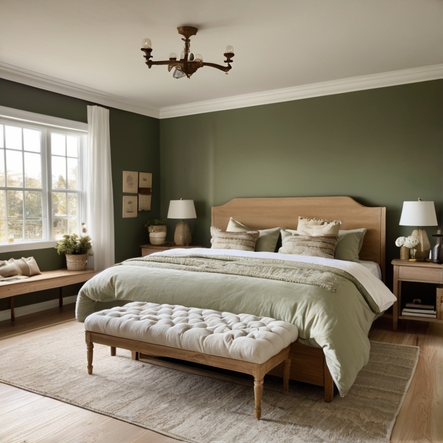
7. Olive Green & Beige
Olive green brings in that cozy, grounded vibe. It’s serious, but not stiff. Think hiking jacket that’s seen some things. When paired with beige, it lightens up without losing that calm energy. Beige softens the green.
Keeps it from going too military. This combo is perfect if you’re trying to create a retreat that feels like a forest cabin without actually moving into the woods. Use olive green on accent walls or in textiles.
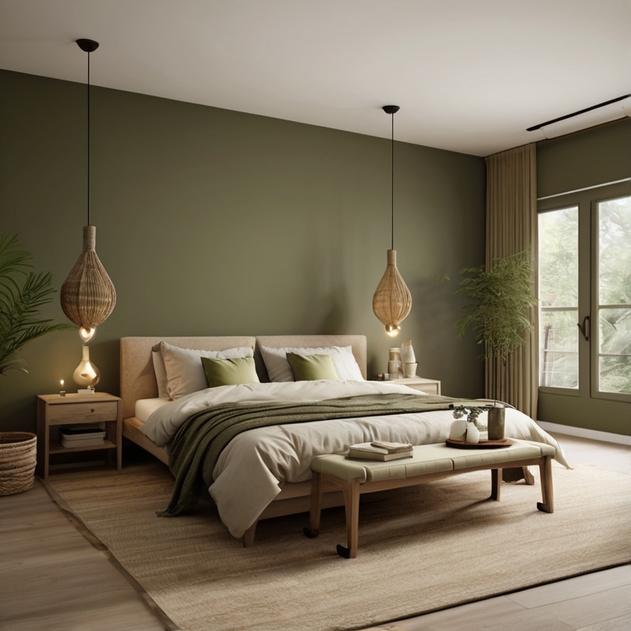
Beige on the bedspread or the walls around it. Throw in some wood accents dark walnut or natural bamboo works great. And plants. Lots of plants. It’s peaceful in a grown-up way.
8. Lavender & Pale Gray
Lavender is tricky. Too much and it starts to feel like candy. But used with restraint? It’s peaceful, almost spa-like. Pale gray keeps it grounded. Think lavender oil diffusing into a room with cool marble floors.
That kind of luxury. The trick here is balance. Maybe lavender sheets with a pale gray bed frame. Or pale gray walls with lavender curtains that sway when the window’s cracked. Add soft lighting warm LED bulbs, not those cold blue ones.
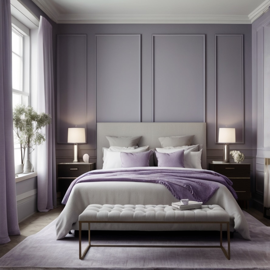
It feels like a deep sigh at the end of a long day. Also, it smells good even when it doesn’t. Weird how color does that, right?
9. Navy Blue & Sand
Navy is deep. Like, lie-on-the-floor-and-think-about-your-life deep. It’s strong and classic, but too much of it can feel like a storm rolling in. That’s where sand comes in.
Sand tones bring warmth, light, and a touch of beachiness to the mix. You get the drama of navy without the gloom. Paint the lower half of the wall navy, upper half sand. Or use navy in your bedding and sand-colored throws and rugs.
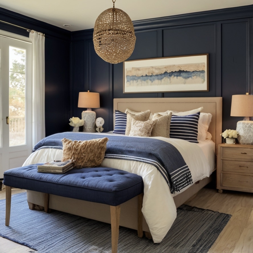
Add brass accents or soft wood tones to round it out. This combo feels like summer nights by the water. Calm, but with a little mystery.
10. Peach & White
This one’s sweet. Not syrupy, just naturally sweet. Peach gives you warmth without being over-the-top. White balances it out, keeps it fresh. It’s like a breakfast smoothie for your bedroom.
Light, happy, and just enough color to make you smile when you wake up. This works well in smaller rooms or spaces that don’t get a lotta light. The peach reflects what it can and white keeps everything feeling airy.
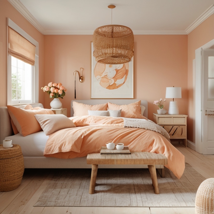
Add rattan furniture, light curtains, and maybe a peach-scented candle if you’re feeling cheeky. It’s not a color scheme for brooding or drama. This is for people who like joy in soft doses.
11. Cream & Warm Walnut
Here’s a combo that feels like your favorite coffee shop in the early morning. Cream is soft, warm, and inviting—like a blank canvas that welcomes all the cozy layers you want to pile on. Warm walnut, on the other hand, is deep, rich, and a little bit luxurious. It’s the furniture, the floor, maybe a wooden headboard that has a story to tell.
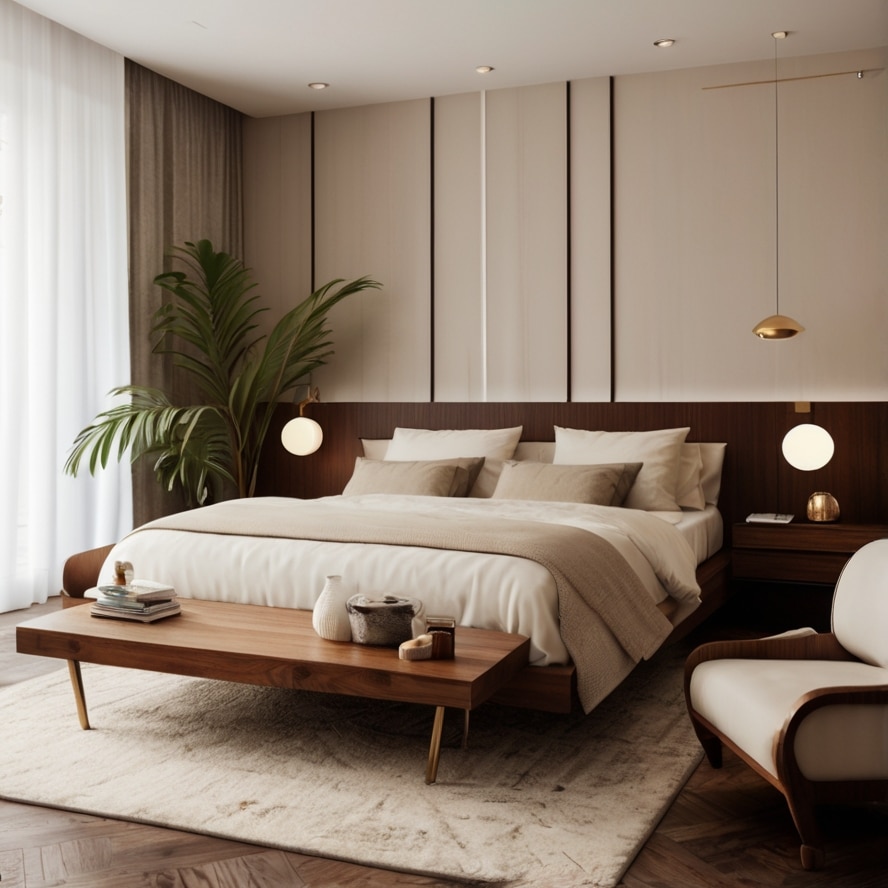
This pairing is perfect if you want your bedroom to feel like a retreat from the rush of the day without screaming “look at me.” The cream keeps it light and open, while the walnut roots everything in calm and comfort. Add a plush cream rug and maybe a few brass or copper accents, and suddenly you’ve got a space that whispers “rest here.”
12. Dusty Blue & Soft Mustard
This one’s a little unexpected. Dusty blue feels like a quiet afternoon sky, gentle but with some depth. Mustard, especially the soft, muted kind, brings a splash of warmth and optimism. Together, they balance each other in the best way—cool meets warm, calm meets cheerful.
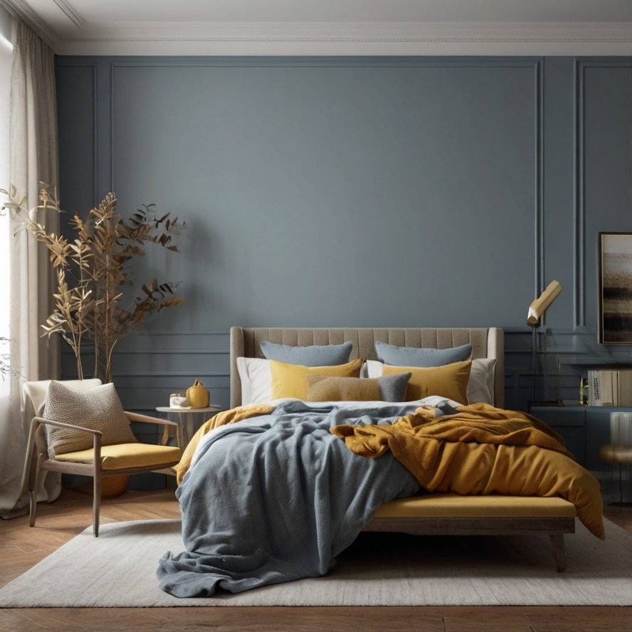
Use dusty blue on the walls and bring in mustard with pillows, throws, or maybe a statement armchair. This isn’t a color combo for the faint of heart, but it’s perfect if you want your bedroom to feel like a thoughtful, creative space. It’s the kind of palette that makes you want to read a book by a window or journal in the morning light.
13. Pale Peach & Soft Gray
Think of pale peach as the shy sibling of bright coral. It’s soft, warm, and feels like a gentle morning light creeping through your curtains. Pair it with soft gray, which cools the peach down without making the room feel cold. This combo is understated but cozy, perfect if you want a space that feels calm but not boring.
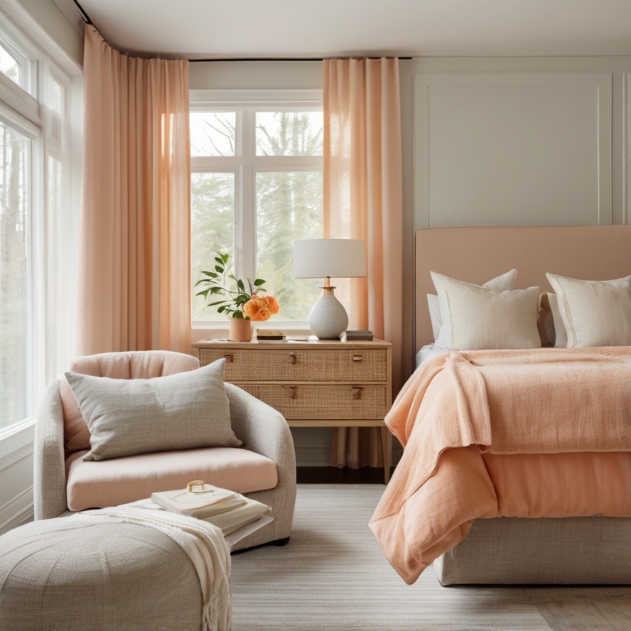
Pale peach on the walls or in textiles adds a subtle warmth, while soft gray anchors the room in sophistication. Throw in a few natural elements—think linen curtains, a woven basket, or a wooden bedside table—and you’ve got a bedroom that’s both inviting and elegant.
14. Mint Green & Off-White
Mint green has this fresh, almost nostalgic feel, like chewing gum from a bubblegum machine but classier. It’s lively without being overpowering. Off-white softens it, making the whole thing feel a bit more grown-up and subtle. This combo is especially good if you want your bedroom to feel bright and airy without going full beach house cliché.
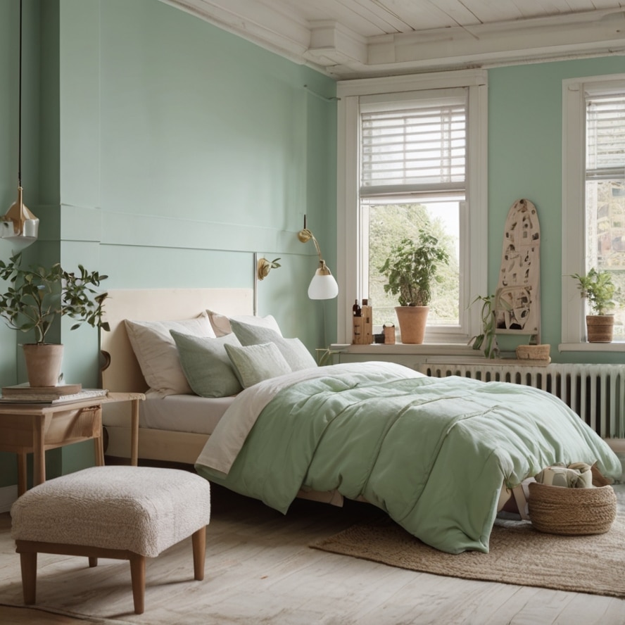
Mint on the walls or bedding with off-white furniture and accents keeps things light and fresh. Add a few quirky vintage pieces or some ceramics to add character. It’s the kind of space that wakes you up gently, like a cool breeze through open windows.
15. Deep Plum & Soft Beige
Deep plum is that rich, velvety color that feels like midnight in a bottle. It’s dramatic, sure, but when paired with soft beige, it becomes way more approachable. Beige tones soften the intensity of plum and bring in warmth.
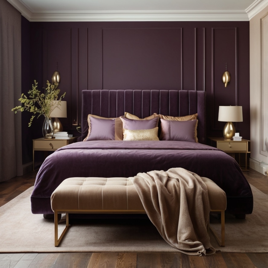
This combo feels indulgent without being heavy, like a velvet sofa with a cashmere throw. You could go with plum on an accent wall or through your bedding and use beige in the furniture and curtains. It’s perfect if you want a bedroom that feels luxurious but also grounded. Throw in some gold or brass accents to elevate the look even more.
16. Sky Gray & Pale Yellow
Gray can sometimes feel a little cold, but when it’s sky gray—a lighter, airier tone—it becomes a perfect backdrop. Pair that with pale yellow, and suddenly your bedroom feels sunny, optimistic, but not overwhelming. It’s like a soft morning glow, just enough light to make you smile but gentle enough to make you want to stay in bed a little longer.
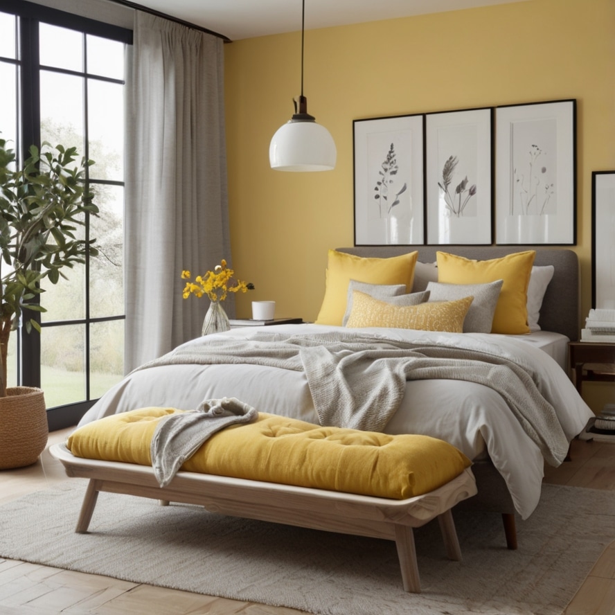
Use gray on the walls and yellow in smaller accents—pillows, lampshades, or even art. This combo works well if you want a cheerful, modern space that’s still soothing. Bonus: it pairs well with natural wood and white details.
Final Thoughts On bedroom Color
Well, choosing a bedroom color scheme isn’t just about picking what looks pretty on Pinterest. It’s about how the colors make you feel when you walk in after a long day. Your bedroom should be your little sanctuary, a place where your mind slows down and your body knows it’s time to rest.
So, don’t rush it. Play with shades, test how the light hits your walls at different times, and most importantly go with what feels right for you. Remember, relaxing doesn’t have to mean boring or bland. Sometimes the most unexpected combos bring the biggest calm.
And hey, a little imperfection in your color choice? That’s part of the charm. Your retreat, your rules. So grab a paintbrush, some swatches, and create a space that hugs you back every single night.

George Martin is a home décor expert and the creative mind behind Home Pedos. With years of experience in transforming spaces, George shares the latest trends, innovative ideas, and practical tips to help you create a home you love. His passion for design is evident in every article, making home styling both accessible and inspiring.